Unwrap Joy
What We did:
Packaging Design
Brand Strategy
Brand world
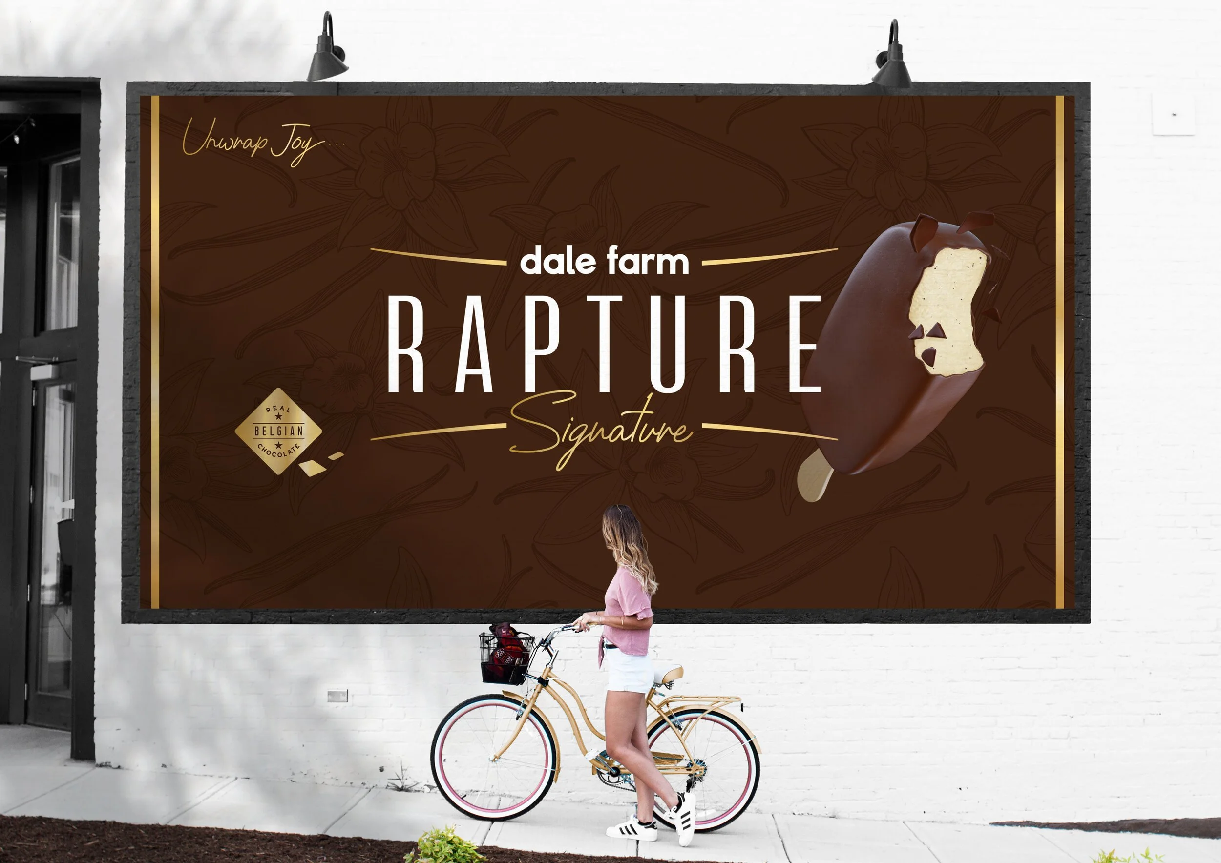
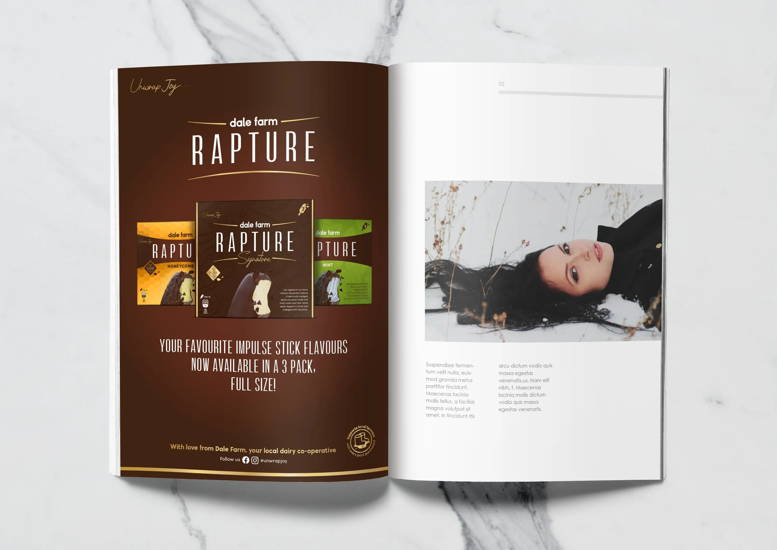
Ad Campaign
Rapture is an indulgent ice cream bar range, and a brand with a heart full of goodness. This range of deliciously creamy dairy ice cream bars are wrapped in the finest thick Belgian chocolate, and are made with the most indulgent of ingredients.
THE BRIEF: The previous packaging design was very dated and generic, and the brand name acted as an apologetic manufacturer’s marque rather than a proud brand. This approach almost disguised the brand as a private label offering, which meant the brand was struggling to maintain its premium price point in store.
THE OPPORTUNITY: Our approach was to give the brand back its confidence with a brand-first approach, delivering a strong brand block in the freezer to aid findability, utilising a cracking chocolate band that visually speaks to the product experience of biting into a Rapture with its cracking thick chocolate casing!
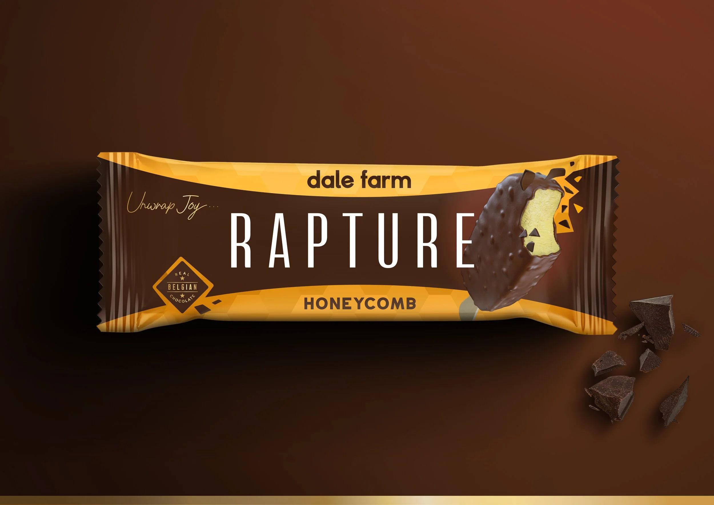
CORE RANGE: Proud and clear branding stands out in the crowded fixture of the freezer. Strong call-out of ‘Belgian Chocolate’, and enticing product photography reassure on quality.
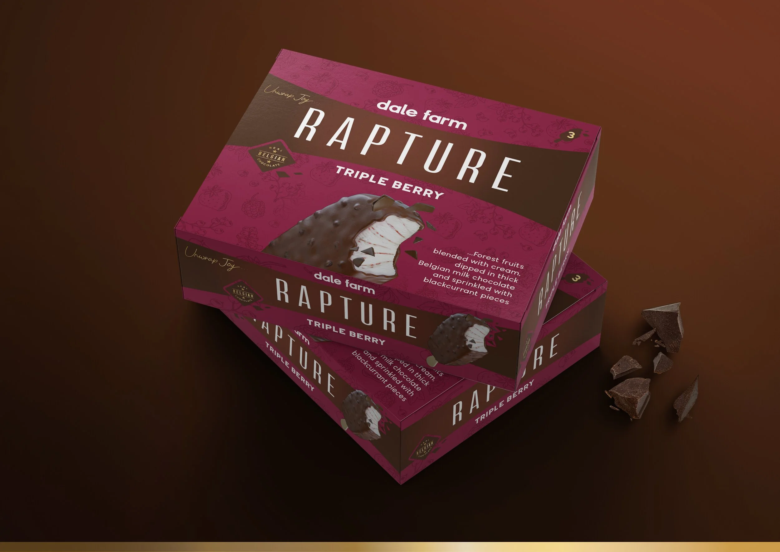
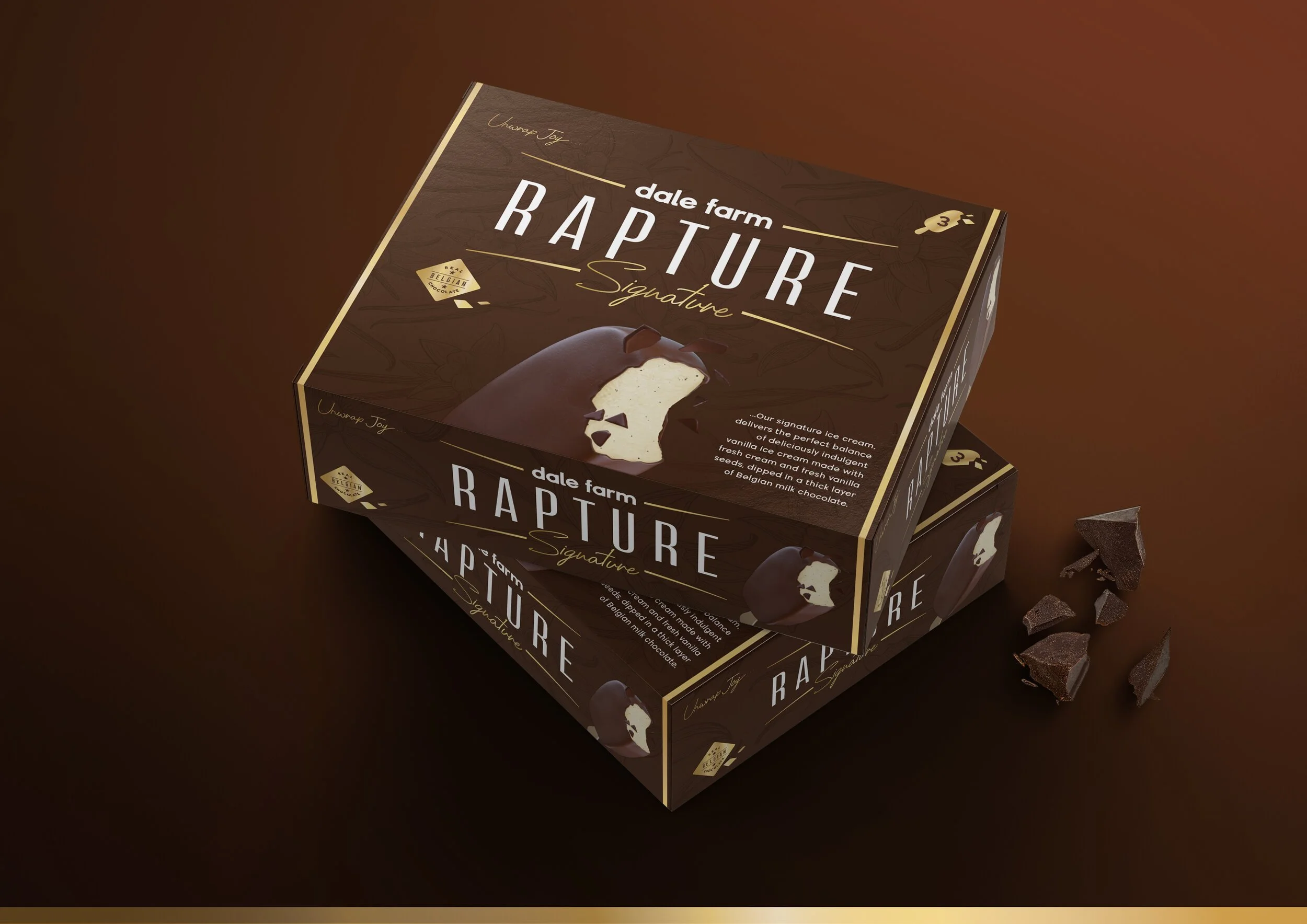
MULTIPACKS: Maintain the brand look and feel, and create strong blocking on shelf. The larger canvas also allows for copy that highlights Rapture’s unique ingredients.
RANGE NAVIGATION: Powerful range navigation was delivered by utilising a consistent brand colour, then signifying the variant with punchy and intuitive background colours.
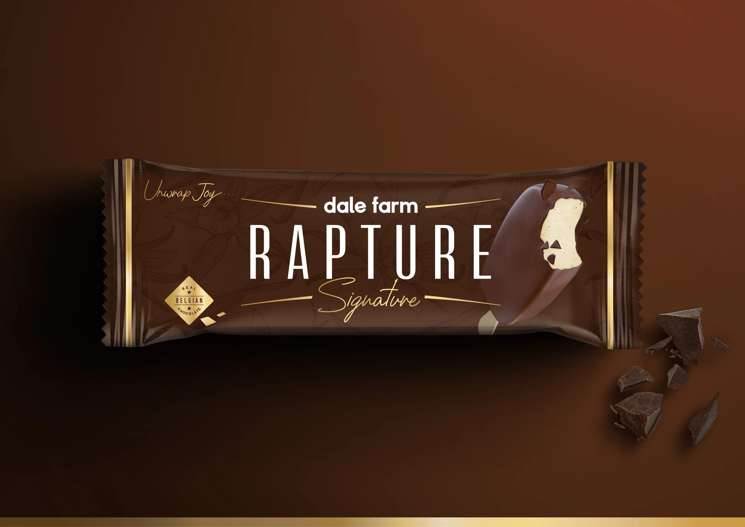
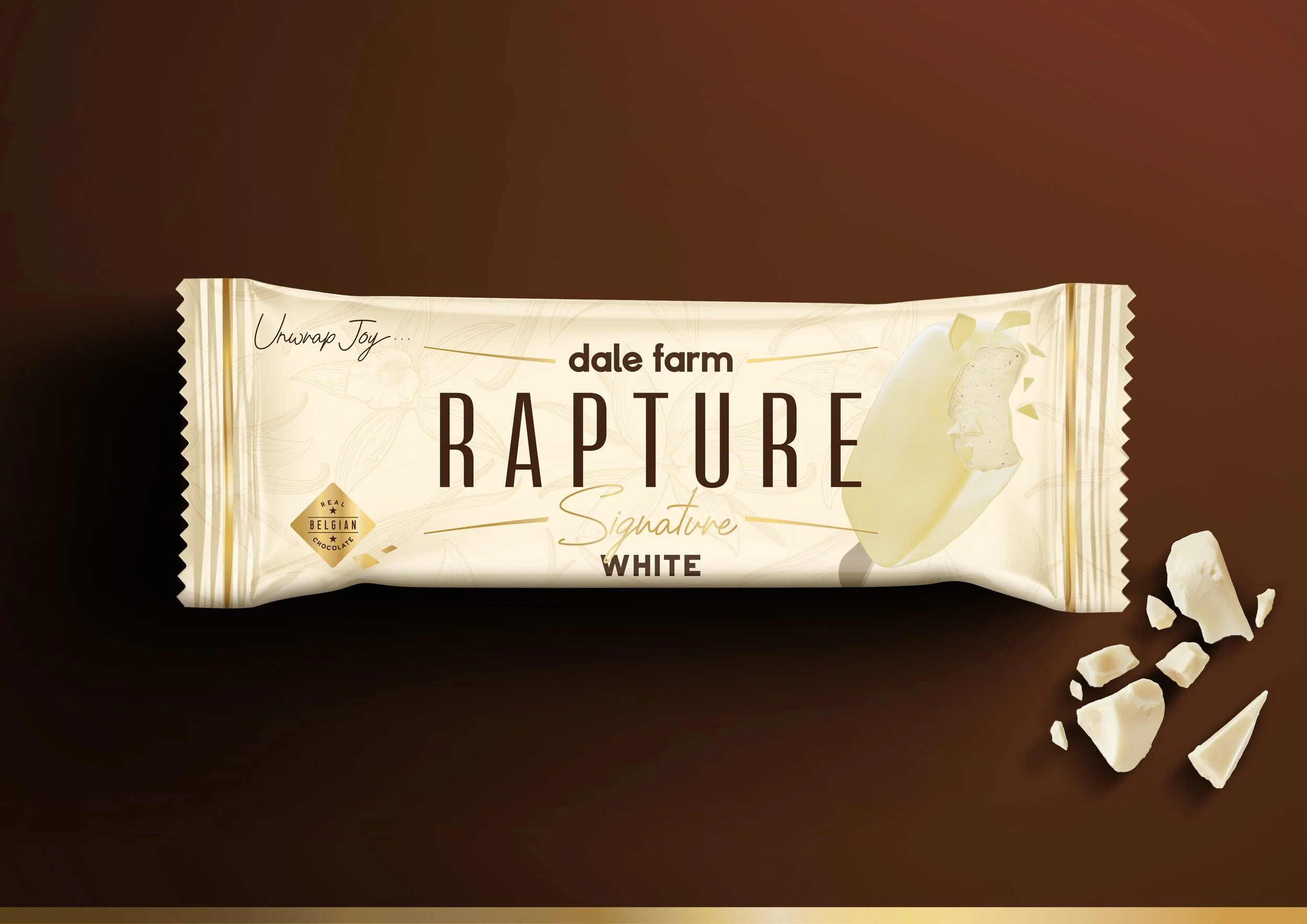
SIGNATURE RANGE: The two original hero variants are slightly elevated in their look & feel, conveying a more indulgent mood than the core range.
SIGNATURE RANGE MULTIPACKS: The multipacks are given a precious treatment, that helps support the brand’s ‘premium everyday’ positioning.
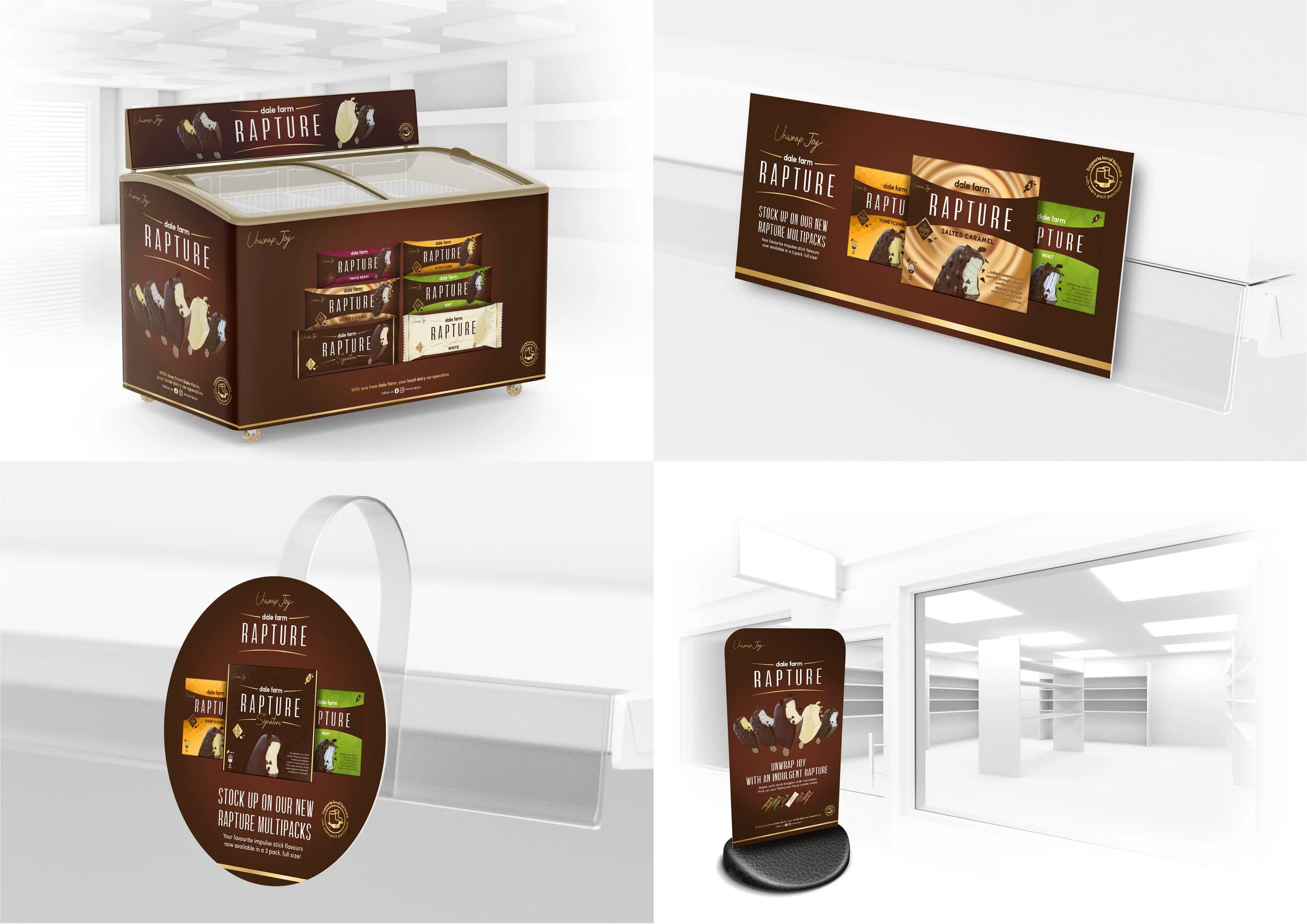
STORE POINT-OF-SALE: A range of touch-points were utilised to announce the brand’s redesign, using a consistent background colour and strong use of product and packaging photography.


