Nostalgia Remixed
What We did:
Packaging Design
Brand Strategy
Brand world
Brand Guidelines
Born over 70 years ago in rural Northern Ireland, Mullin’s use only locally sourced Irish milk from their Irish farmer owned co-operative, together with locally sourced ingredients to create their delicious award winning ice creams.
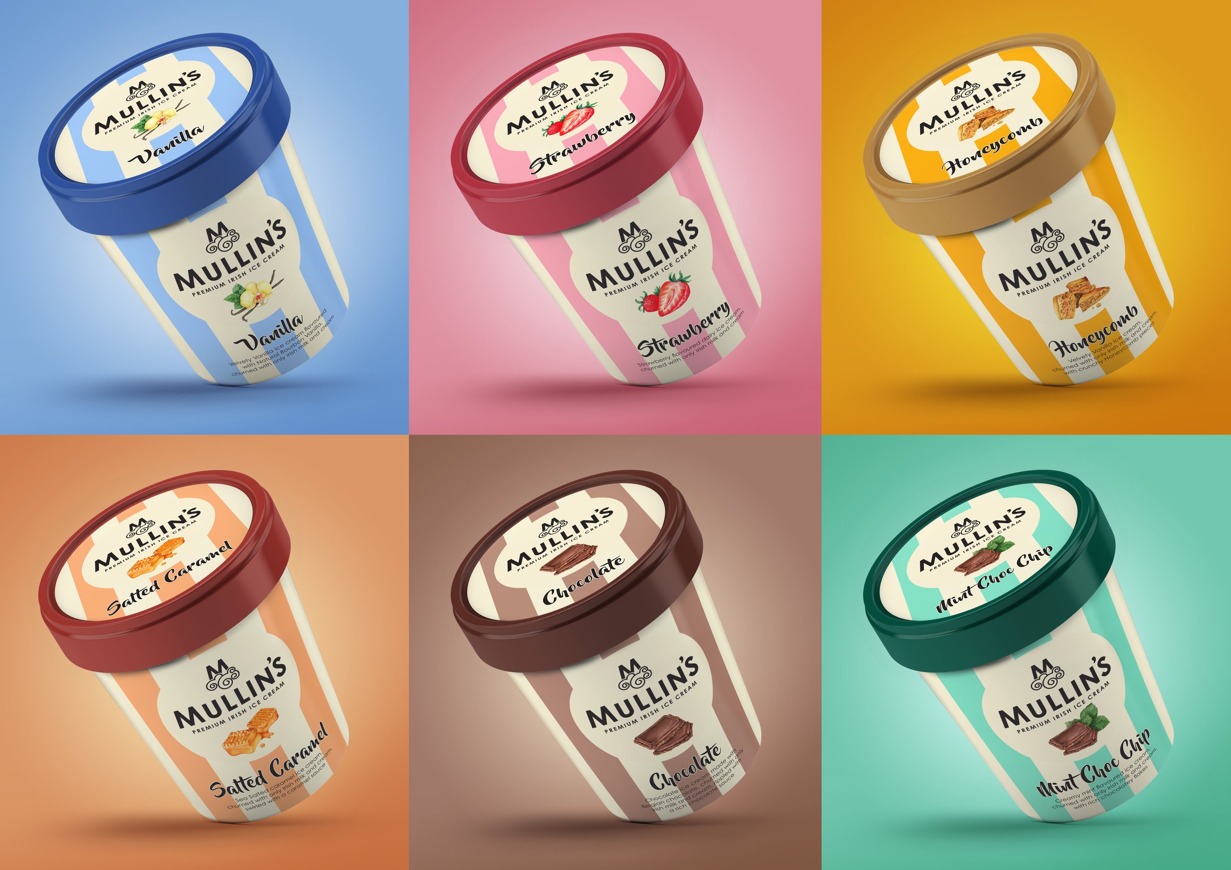
THE BRIEF: Mullin’s asked us to reinvigorate and modernise their range of Irish ice creams, highlighting their delicious natural ingredients. Being a true classic Northern Irish brand, it was important to respect but reinvigorate the current recognisable brand visual equities.
THE OPPORTUNITY: We used watercolour illustrations and hand-drawn typography to deliver craft, then leveraged their stripe equity to drive powerful standout in the freezer… fresh!
RANGE NAVIGATION: Powerful range navigation was delivered by utilising cream as a consistent brand colour, then signifying the variant colour leveraging the stripes.
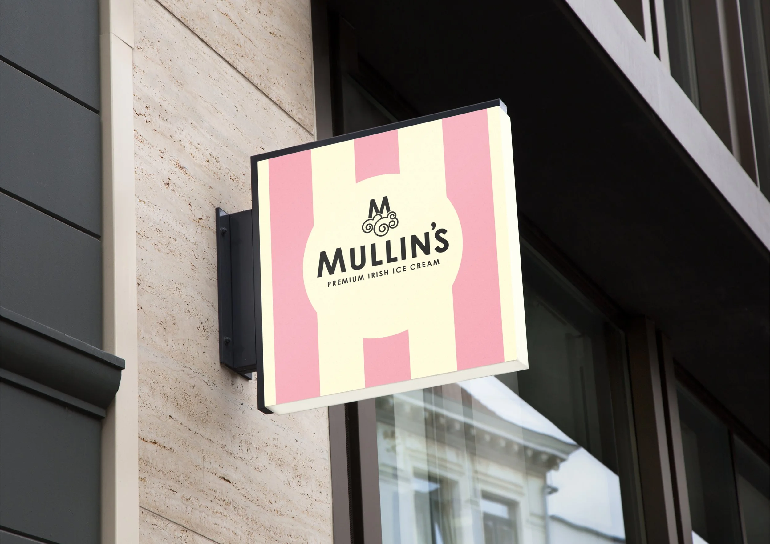
BRAND MARQUE: The brand marque was crafted to feel contemporary and relevant, with a nod to nostalgia and heritage.
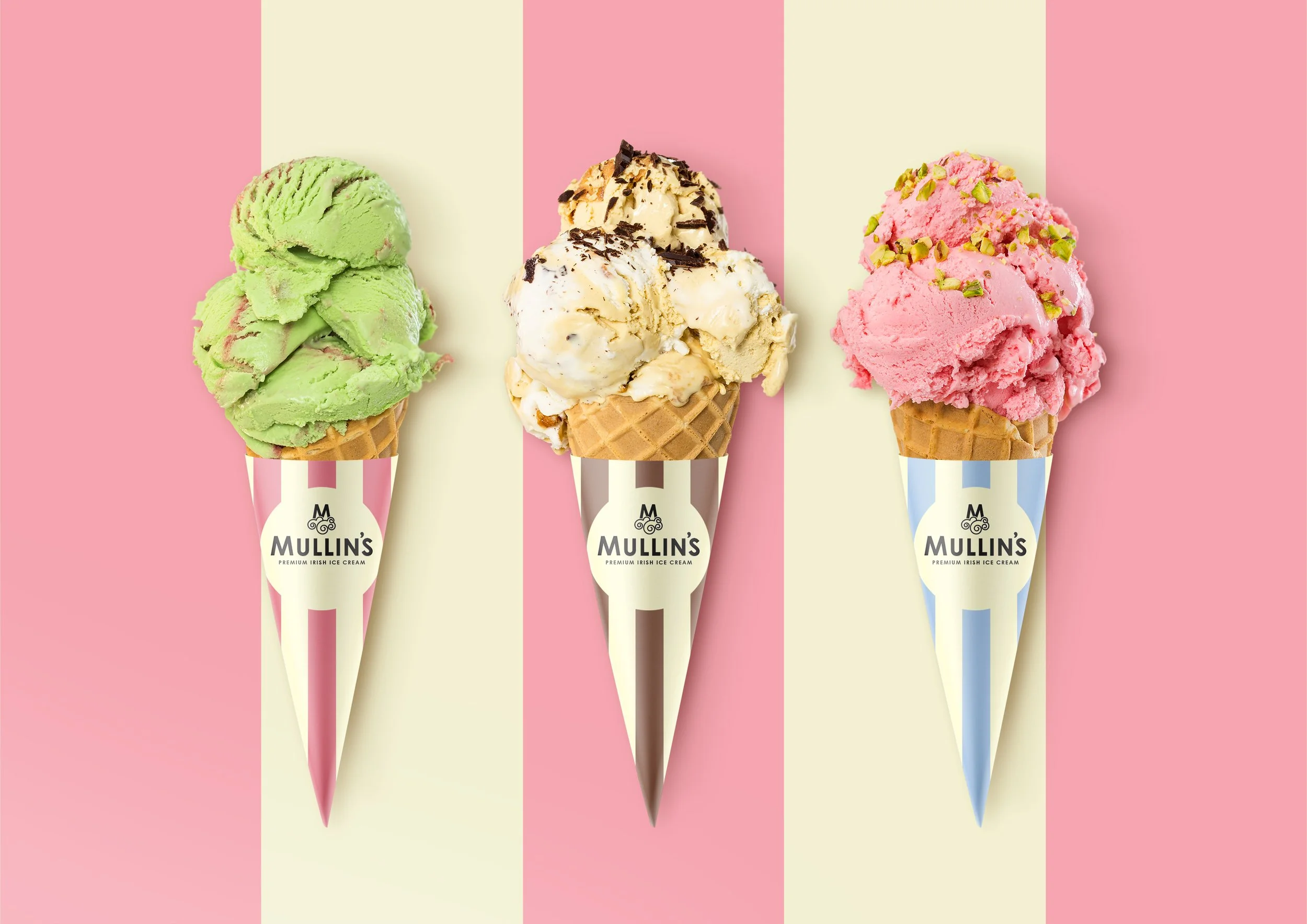
STRIPES: A powerful equity for the brand, that creates instant brand recognition for the devoted fans of this historic brand.
INTERIOR DESIGN: Leveraging the brand colours of cream, pink, and black meant that the interiors of the ice cream parlours could be fresh, bright, and inviting.
ICE CREAM VAN: The ultimate in nostalgia! If you don’t hear it coming, you will certainly recognise it as Mullin’s from a long way away!
IRELAND’S FAVOURITES RANGE CREATION: After a successful relaunch of the core range, a premium ‘Ireland’s Favourites’ range was created. Even more indulgent!
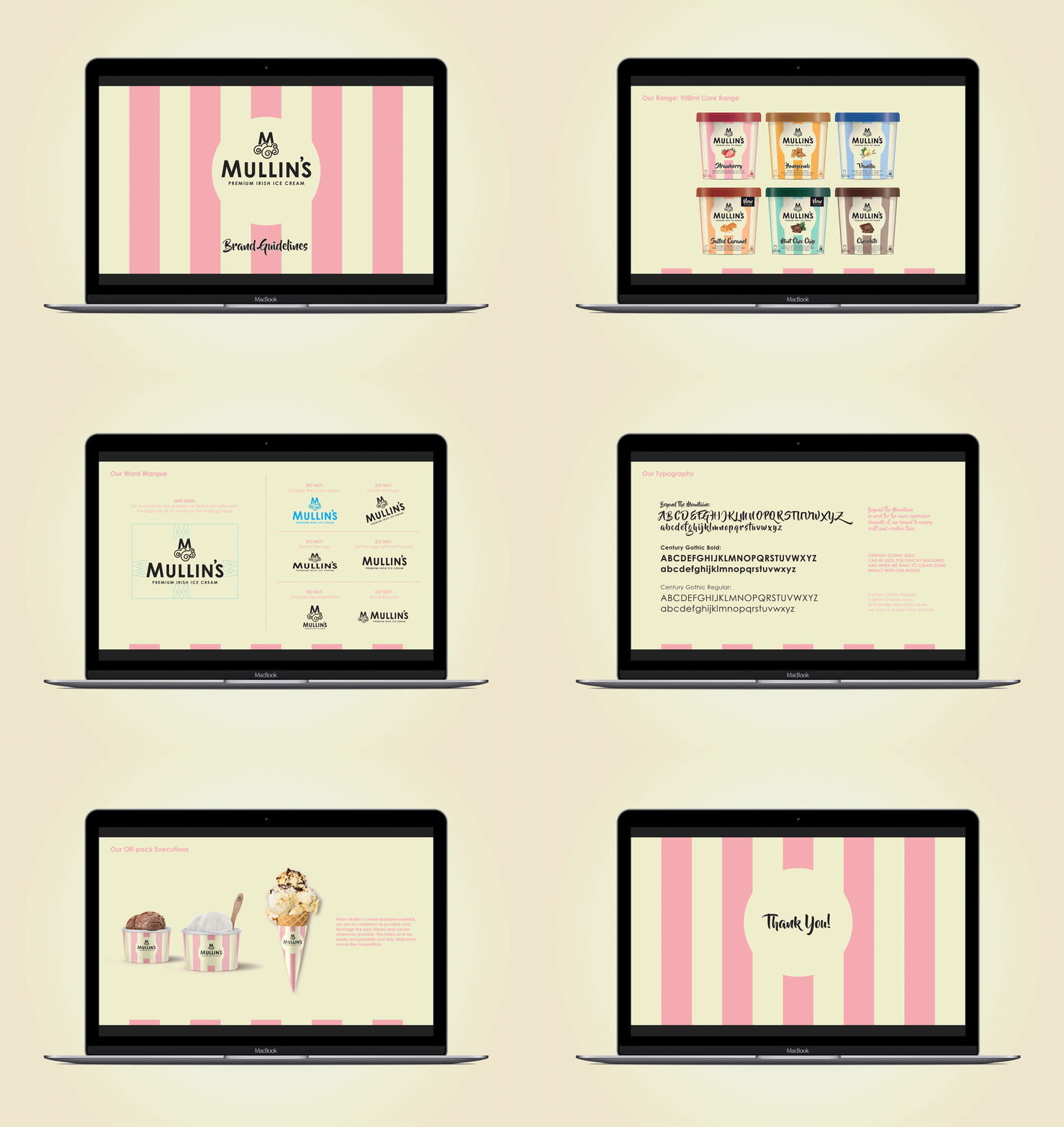
BRAND GUIDELINES: A comprehensive set of guidelines was created to keep the brand consistent in the future, and allow for seamless innovation.


