Spirit of Togetherness
What We did:
Packaging Design
3D Bottle Design
Brand Strategy
Brand world
Kalki Moon, is a family owned and run artisan distillery in the heart of Bundaberg. Their ethos is to buy and act locally, from the ingredients they use to the equipment they distill in, and their mission is to make the perfect gin for the everyday Aussie.
THE BRIEF: Help us evolve our current design to reflect the care and attention we put into the liquid inside. Redesign the graphics, and create a bespoke bottle design to elevate our presence on shelf and highlight the value we provide. The Kalki Moon range has a unique price point which is much lower than other artisan gins, and we never want to change this.
THE OPPORTUNITY: Build on and improve the current brand visual equities to keep recognition with loyal consumers, but at the same time increase the value perception of the brand to bring new ones in. Bring the quirky brand story to life to engage more with consumers, and create a strong family feel across the range.
BRAND TONE OF VOICE: Keeping our brand language uncomplicated and approachable reflects the price point and the ‘Spirit of togetherness’ positioning we defined.
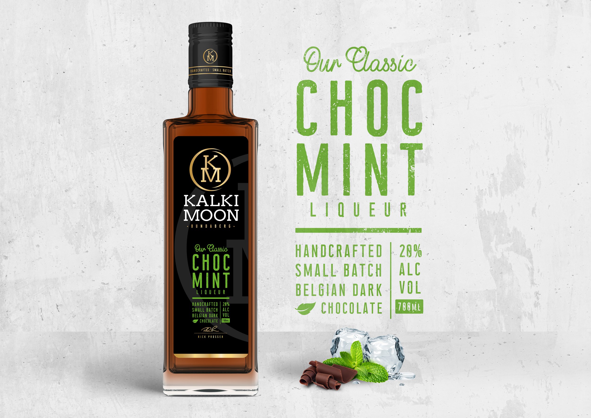
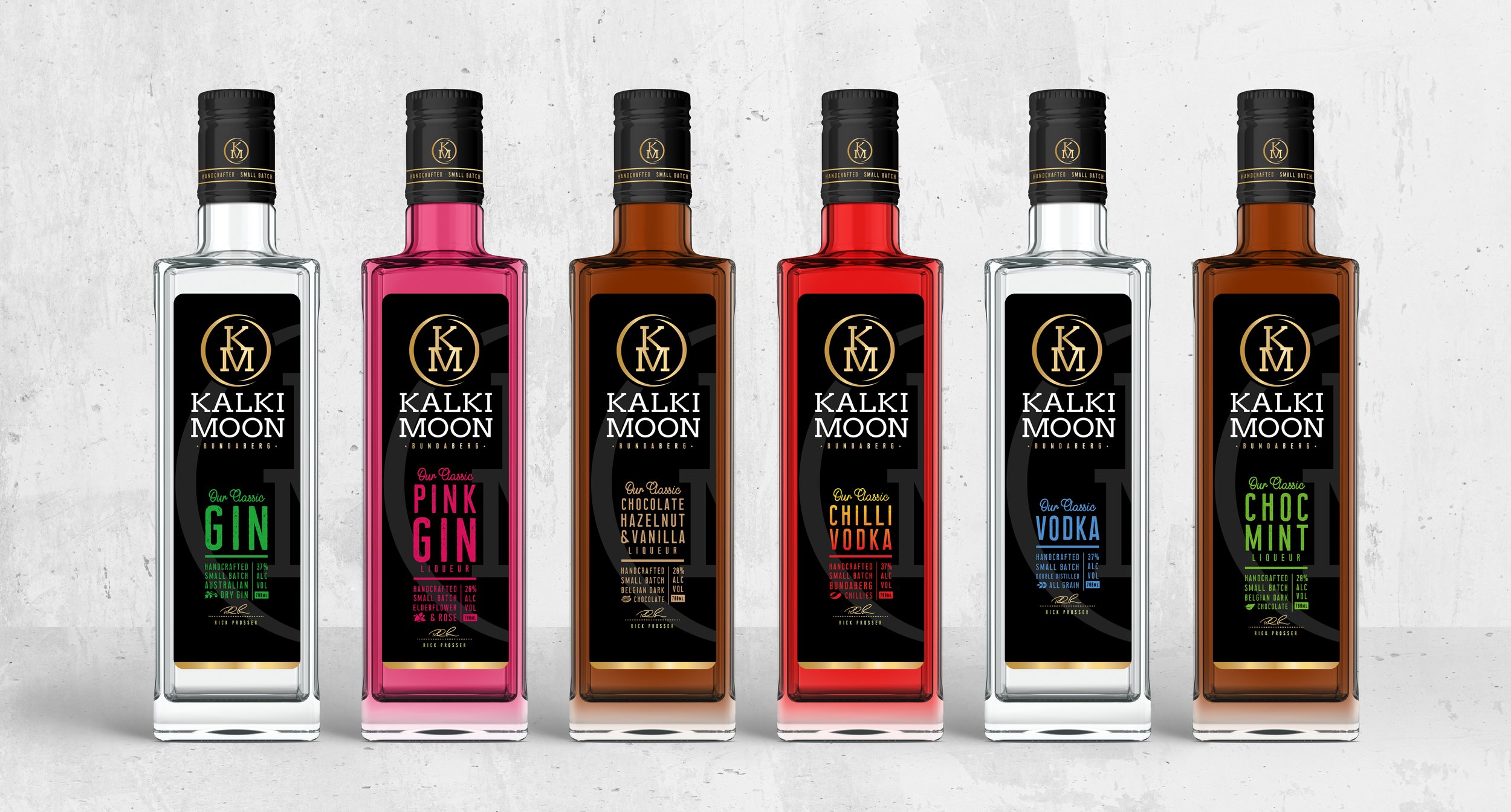
CLEAR RANGE NAVIGATION: The liquid colours do a lot to help navigation, but we also wanted an injection of colour into each of our descriptive labels.
BRAND MARQUE: Our new Kalki Moon logo reflects both the moons cycles, but also the end of a distillery barrel.
3D BOTTLE DESIGN: Our chunky square bottle design echoes the brands robust nature, with a hint of elegance through the side emboss design… refreshing!
3D BOTTLE DESIGN: The side emboss of the bottle illustrates the moons cycles, taken from the year the brand was established.
THE DISTILLERY: Robust materials for a robust, no nonsense brand.
VISUAL LOOK & FEEL: We wanted to look at home in a dark bar, but also have strong standout in the incredibly busy shopping fixture of the multiples.
A STRONG FAMILY LOOK & FEEL: It was important to have a holistic and consistent look & feel for the whole range, and to ensure a steady foundation and clear visual strategy for future innovation.


